

Personal Branding
Branding
2021
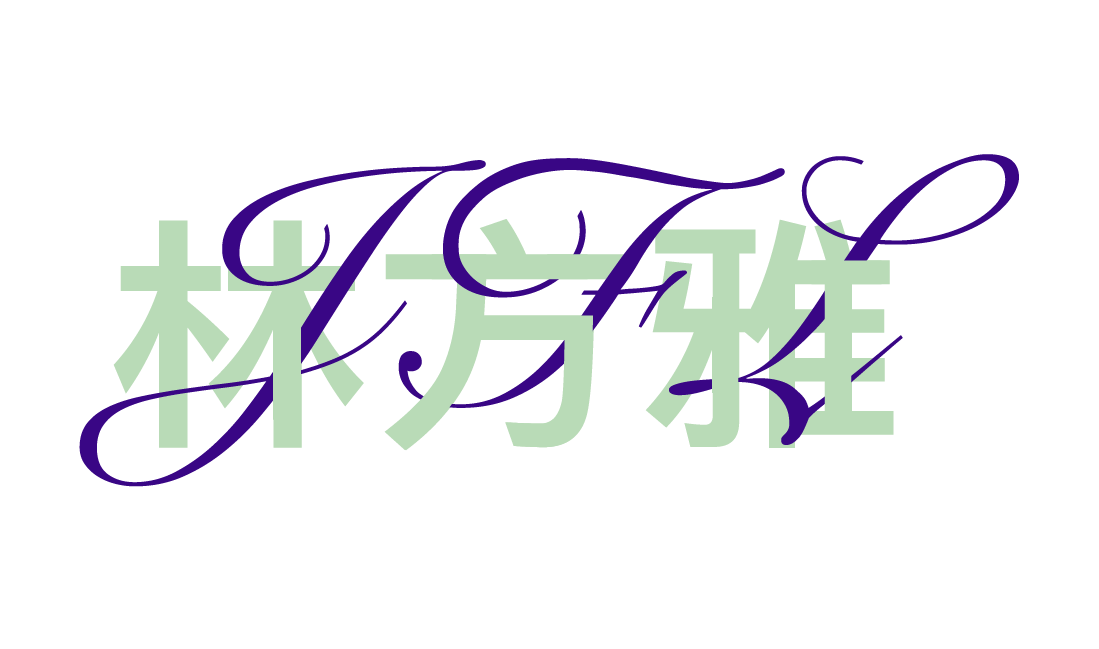
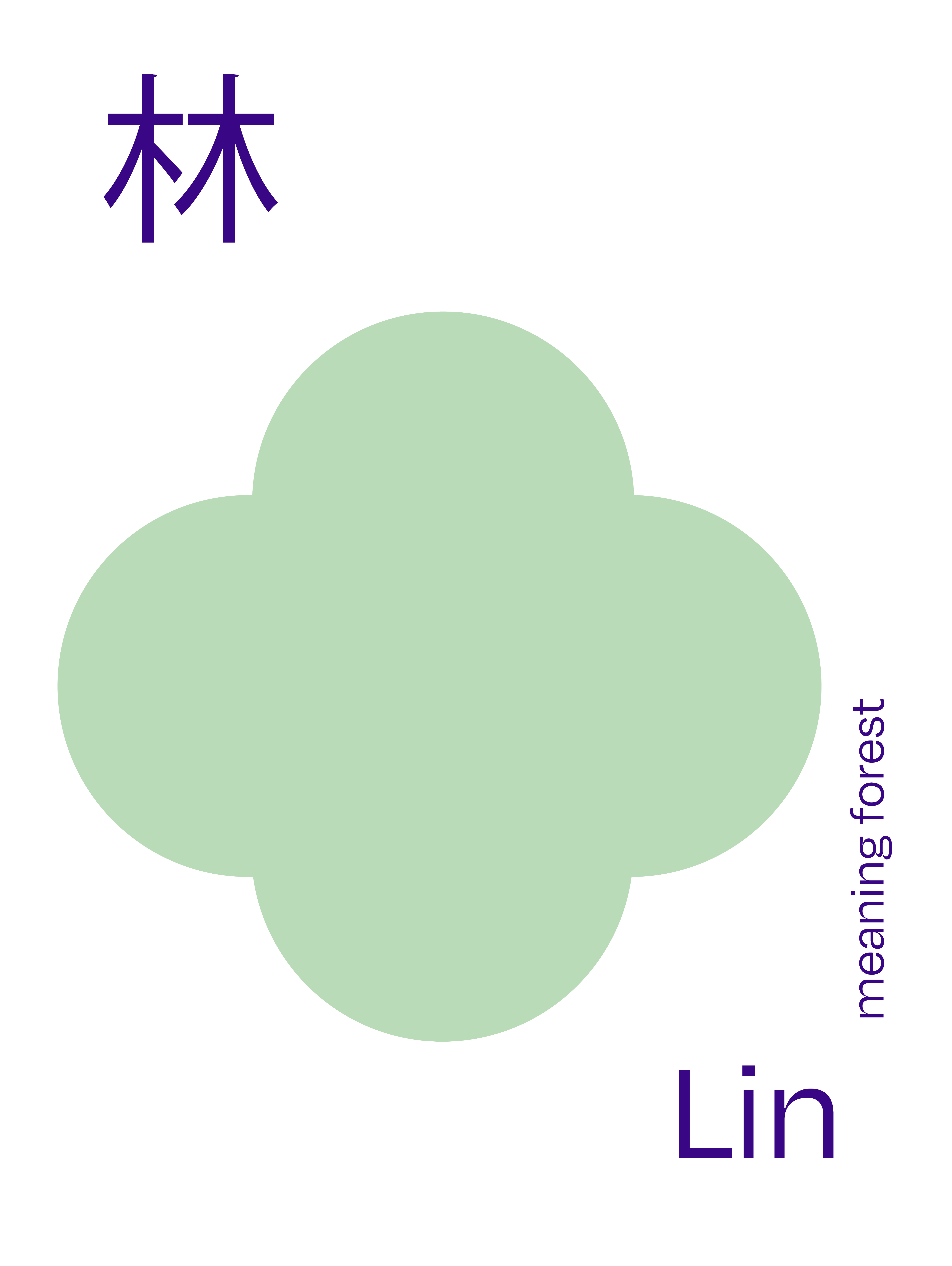
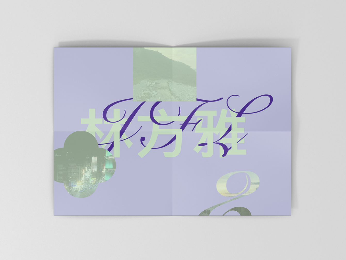
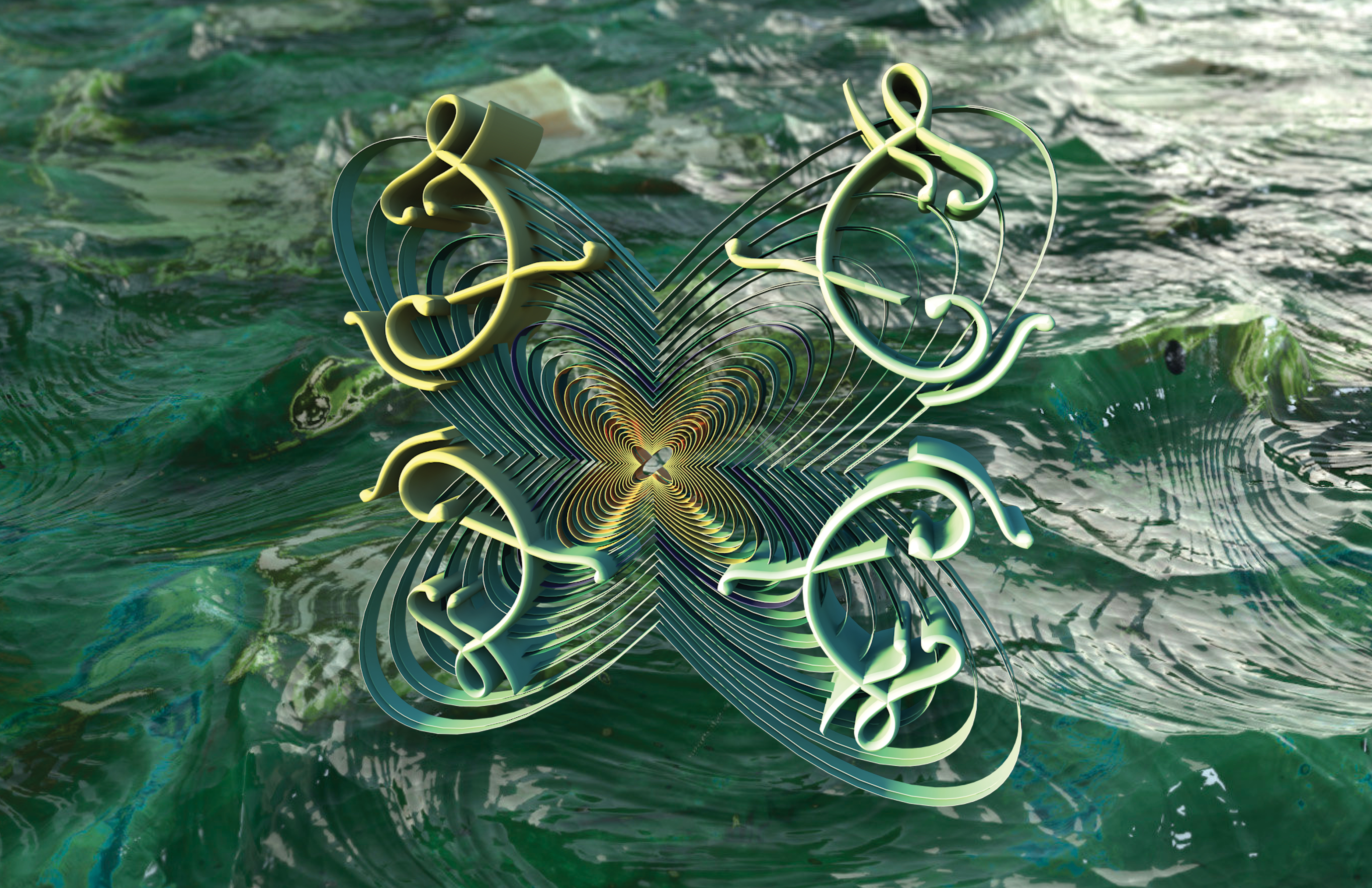
The way the English and Chinese typefaces are intertwined intrinsically ties to my identity as a second generation Taiwanese-American because these parts of my life are indistinguishable from each other.
The English script is of my initials and represents the fluidity of speaking English as compared to the blocky Chinese characters because Chinese does not come easy to me and, oftentimes, my Mardarian sounds choppy.
I took inspiration from Taiwan and California’s scenic landscape. The dark purple is my favorite color and reminds me of a family trip to Napa, filled with fields of lavender. The mint green is reminiscent of my grandparent’s farm in the mountains of Taiwan, covered in tropical plants.
The abstract shapes are a visual language, symbolizing each of the Chinese characters.


Pavise
Campaign
2023
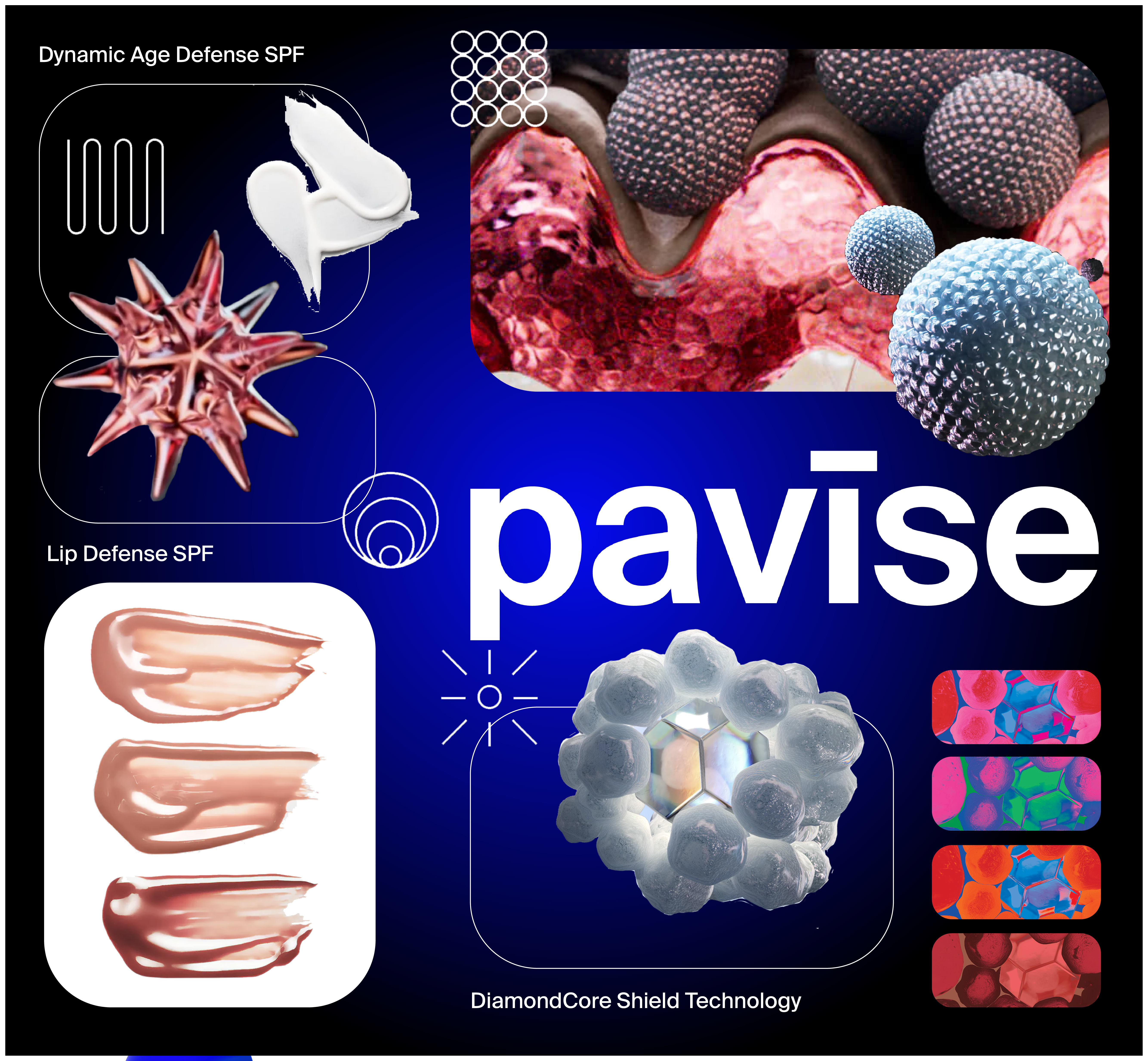
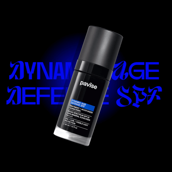
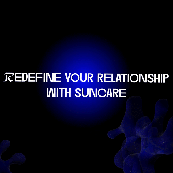
The objective behind the graphics was to inform the public about Pavise, a suncare and skincare brand. In my design process, I initiated by creating a moodboard, jotting down keywords, and studying competitors within the industry. My research was centered on discovering how Pavise could establish a distinctive presence. One notable aspect was Pavise's utilization of vibrant neon colors, in stark contrast to competitors like Tacha, who opted for softer pastel hues.
One key lesson I derived from this design experience was the importance of striking a balance between visuals and text. Throughout the process, I sought feedback from my peers.
Reflecting on the project, if I were to approach it differently, I would place a greater emphasis on ensuring legibility. The use of the font "DirtyLine 360DaysofType 2022" posed readability challenges, especially when combined with the neon color palette.

Forms 360
Website
2023
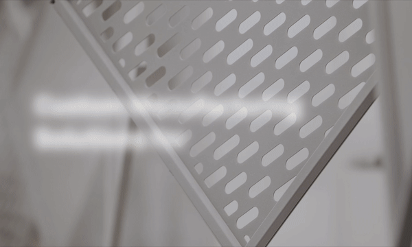
Forms360 is a subrand of Forms+Surfaces, an architecture and landscape achriecture firm based in Santa Barabara. I helped create the video for their landing page and organized the information for their page. Visit website here.
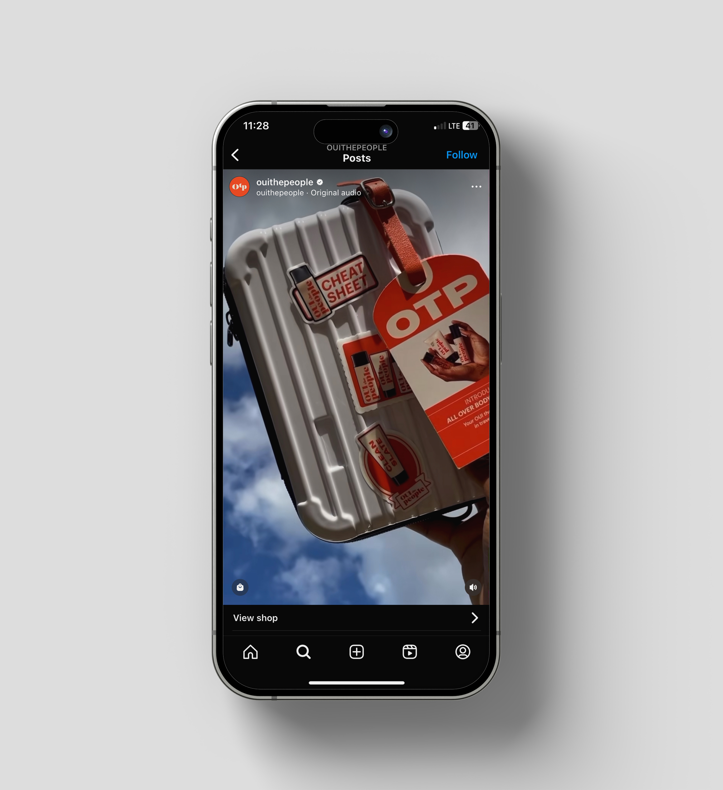
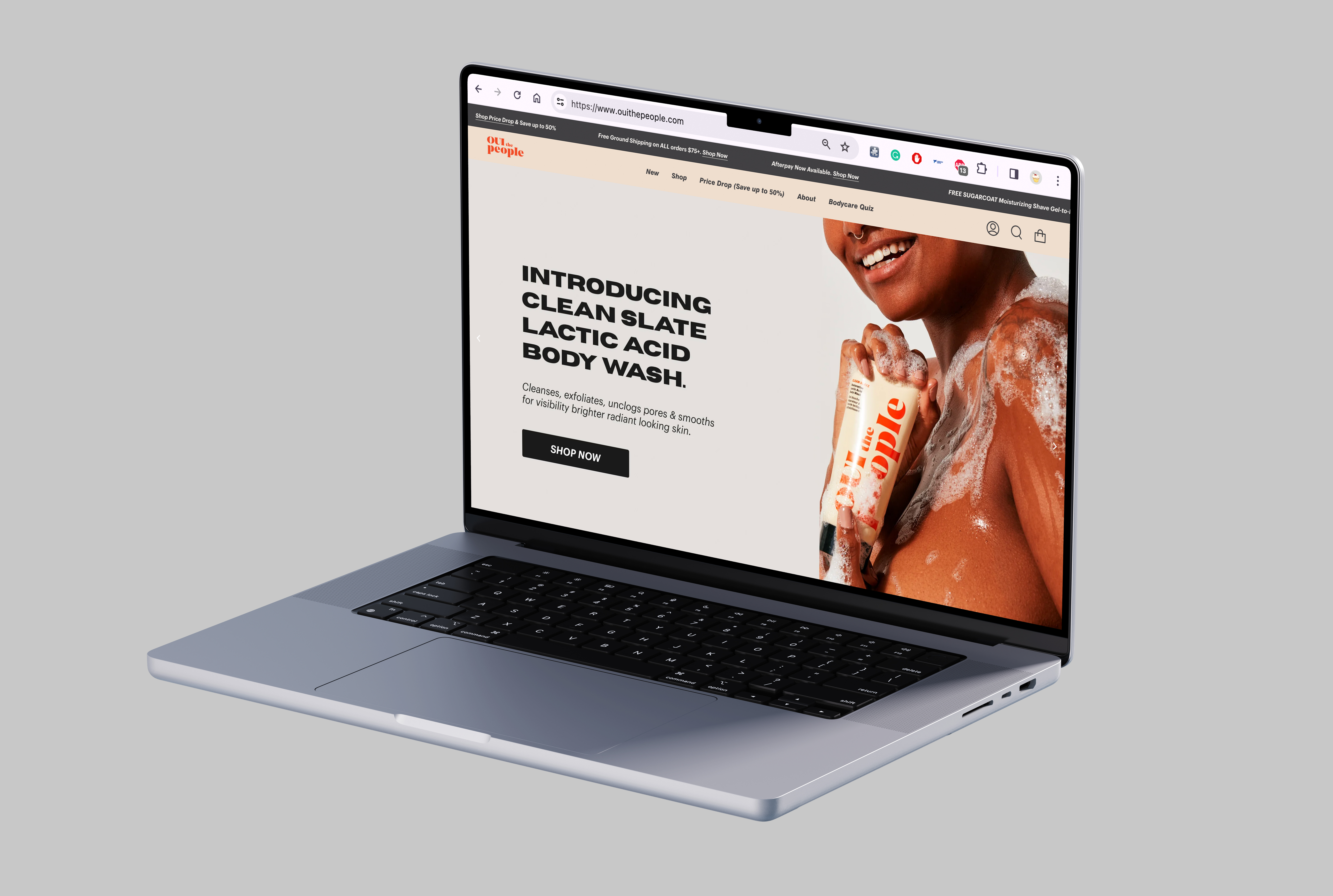
OUI The People
2023
Created travel-theme stickers for their suitcase influencer package. I also helped created web banners for their site.
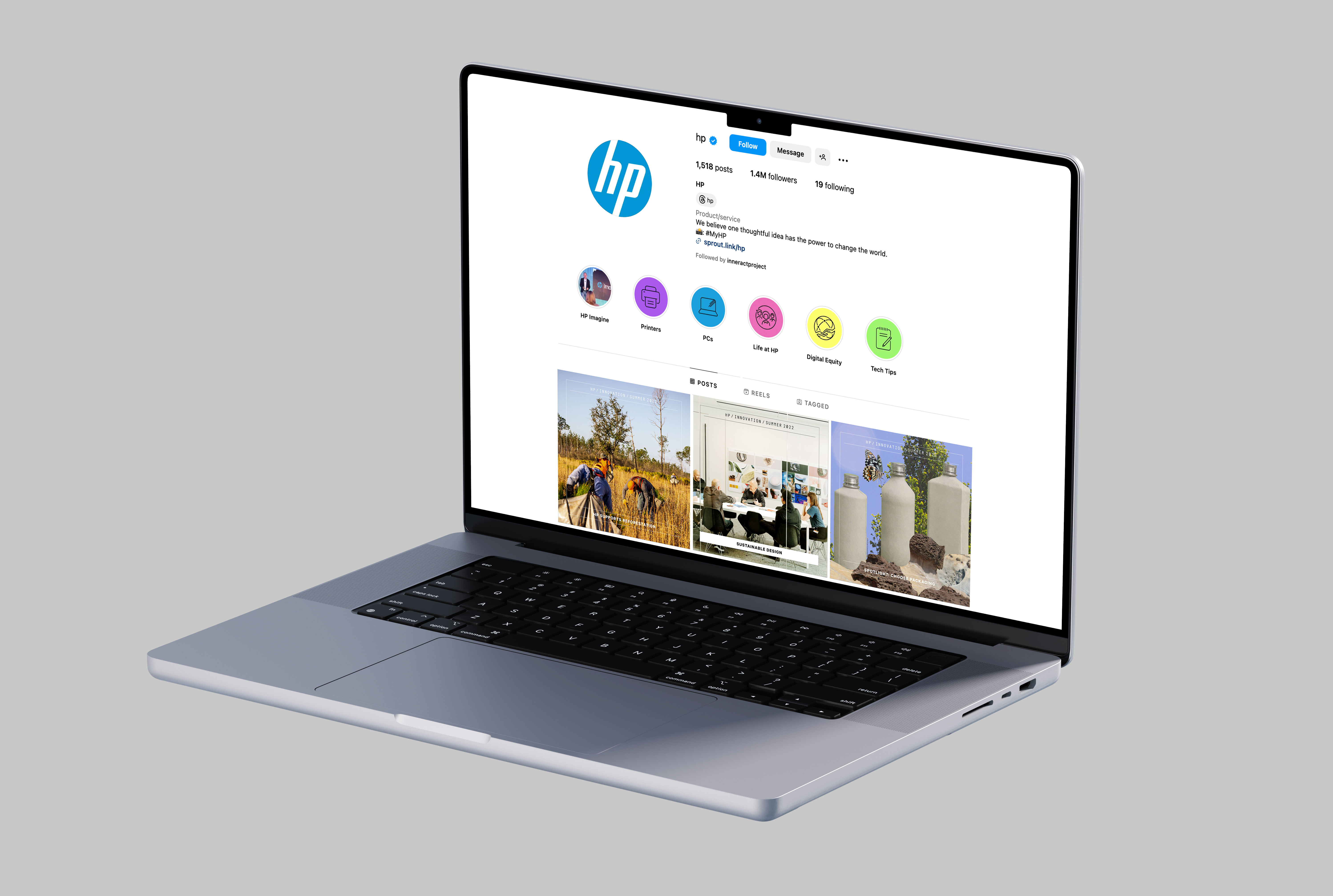
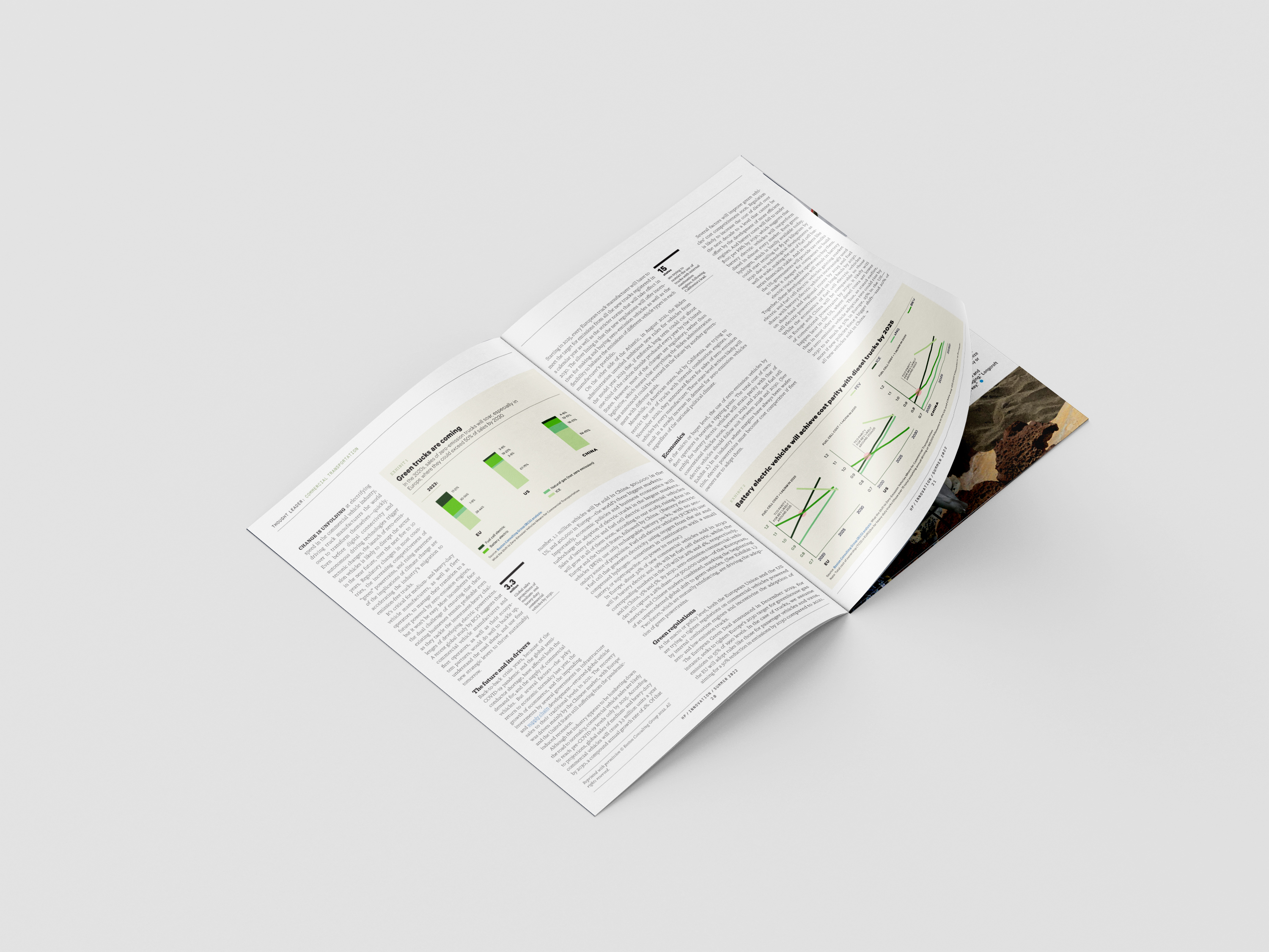
HP Inc.
Branding
2022
I worked at HP Inc. and helped promote their HP Stories through social media posts for Facebook, Linkedin, and Instagram. I collaborated with Patrica Sanchez (Sr. Art Director), Bianca Tamura (Content Production Manager), Sarah Murry (Copywriter), and Henry Cunningham (Visual Designer).